
Style Settings of Forms
Form Entries that have one or more visible components may include the following settings that you can use to further customize your form. Changing the style of your entry allows you to customize the font, size, customize borders, height/widths, etc. These style settings are the same whether you are working with basic or visual layout.
Style Settings:
Form Assistance (This entry is on the field tab in visual mode.) allows you to provide hints or specific instructions as to the type of information that should be entered in a field, detail any requirements or constraints on the amount of text is allowed in a text field, explain the different options when choices are available, or otherwise convey extra information to your users regarding the entry. The text that you enter will be displayed when a user's mouse hovers over the form entry. Users will find this information helpful as then complete their forms and you may find that you receive fewer requests for assistance when these extra instructions are present.
The entries below are on the style tab in visual mode:
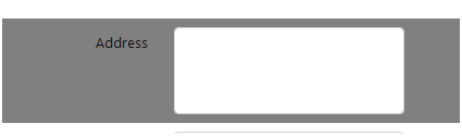
Element Height allows you to change the height (em) of the entry. This controls the height of the box which surrounds the whole field; in example element height is set to 20 em (background set to gray for visual)
Element Width allows you to change the width (em) of an entry. This controls the width of the box which surrounds the whole field; in example element width is set to 50% 
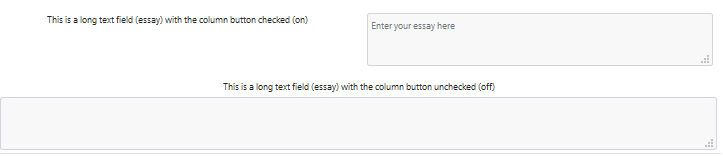
Columns allows you to select whether the field will display in column format or not.
Width of Title Column allows you to control the width of the title of the field; in the example the width of the title column is set to 60% 
Element Padding allows you to edit how much space you want in between your entry from top to bottom. This keeps the field centered in the space; in example element padding set to 30px.
Element Margin allows you to edit how much space you want around the outer border of the field
Element Border Style can be used to change the type of style you want your border to be (i.e, dotted, dashed, solid, double).
Element Border Width allows you to change the size of the border style.
Element Border Color can be used to change the color of your border.
In the example the color is set to red and the width is set to 6px
Field Height controls the height of the field; in example field height is set to 5em
Field Width controls the width of the field; in example field width (white area) is set to 11em

Background Color can be used to change the background color of your entry. In the example the background is set to red. You can also use hex color codes.
Font Color allows you to change the font color of your entry. In the example the color is set to blue. You can also use hex color codes.
Font Size allows you to change the font size of your entry. A drop down list appears where you can choose from 5 different font sizes. In example first selection is “extra large”, second is “small”.
Text Alignment allows you to change the alignment of the text in the entry. A drop down list appears where you can choose from either Right, Left, or Center. The example is set to left
Bold/Italics check boxes can be used to bold or italicize your font in an entry. In example “address” is bold and “city” is not

In example “address” is italicized and “city” is not

Element Style can be used to set style attributes for the entry's table row.
Field Style can be used to set style attributes for a displayed database field.
|
|
You may also use HTML color codes to enhance your form. Instead of typing in color names such as red, white, blue, you may use a color generator. As you see in the example above, the background color is set to a red but uses a code instead of a name. This way, you are able to use various colors rather than using the basics. |
|
|
(em)- The 'em' unit is equal to the current font size. For instance, if the font size of the entry is 12pt, 1em would be equal to 12pt. 2ems would equal to 24pt font. The exception is when 'em' occurs in the value of the 'font-size' property itself, in which case it refers to the font size of the parent element. An 'em' is equivalent to the width of a capital 'M' character. It may be used for vertical or horizontal measurement. |
Also see: